A REBRAND
without the brand.
CGCC Athletic Branding
A First of Its Kind
Columbia-Greene's Athletic Director, Walter Rickard, came to Summit in late 2014 with a unique project.
CGCC had an established athletic department but had yet to create any sort of branding for their athletic teams. Instead, they had leaned on the university brand to represent the Twins on-the-field. Rickard tasked the designers at Summit with creating the first brand in school history that would be created with the athletic department in mind.
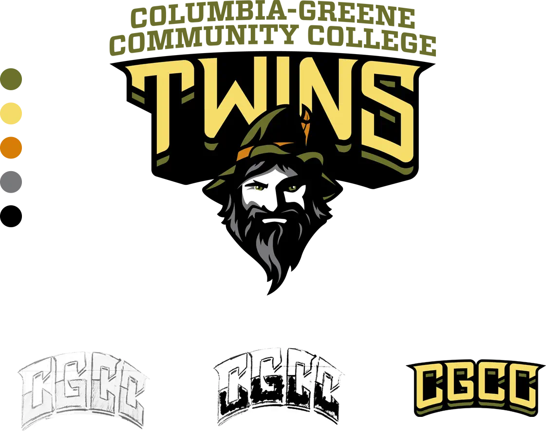
Though they are nicknamed the Twins (for the two counties that combine to sponsor the school), their most notable piece of folklore was around the fact that Rip Van Winkle inhabited the mountainous region around the college. As something that literally no other college in the United States could claim, this seemed like an avenue rich with possibilities.
From there, the possibilities were endless.
Team
Columbia-Greene Community College
Department
Marketing/Communications
Service
Our instinct was to just start sketching. After we received the ideas and feedback that we needed from their internal meetings, that's exactly what we did.
Refining the Vision
We drew up 8-10 different variations of the Rip Van Winkle mark so that Rickard could share with the rest of the group.
With each round of additional feedback, we narrowed in on one concept that stood out as our clear winner. From there, we simply made small tweaks to the character. What type of hat would he wear? How would his hair and beard appear after sleeping in the Catskills for years? Throughout the process, we continued to provide a handful of variations with each round so that we could achieve buy-in from the appropriate stakeholders.
When you're happy,
we're happy.
Alluding to Academics
Because CGCC had previously embraced the college's academic branding, we wanted to pay tribute to their history and maintain a direct line from the past to the future. The shape of Rip Van Winkle's beard follows similar lines as CGCC's academic logo and we incorporated their existing color scheme throughout.
Our first priority is always ensuring that the client is completely happy with the approved artwork and, in this case, they were extremely excited about the final product. But, on top of that, we also had some goals in mind that we wanted to achieve with the CGCC rebrand.
Revealing with Rave Reviews
The logo needed to be highly functional and embody the athletic teams with ease. One of our main concerns was that nothing about the Rip Van Winkle mark screamed "Twins." Our way of representing the dual-nature of the community was with the type. "CGCC" and "Twins" both appear to have two layers – one representing Columbia County and the other representing Greene County.
The mark also needed to be able to employed across any platform (print materials, uniforms, mascot, etc.) and, in that regard, this was one of our most successful branding projects. Shortly after the official logo reveal, CGCC debuted their uniforms and mascot, "Rip", to extremely positive feedback. It also gave the student-athletes an identity that maintains an athletic specific look-and-feel that they can wear with pride on campus and in the community.