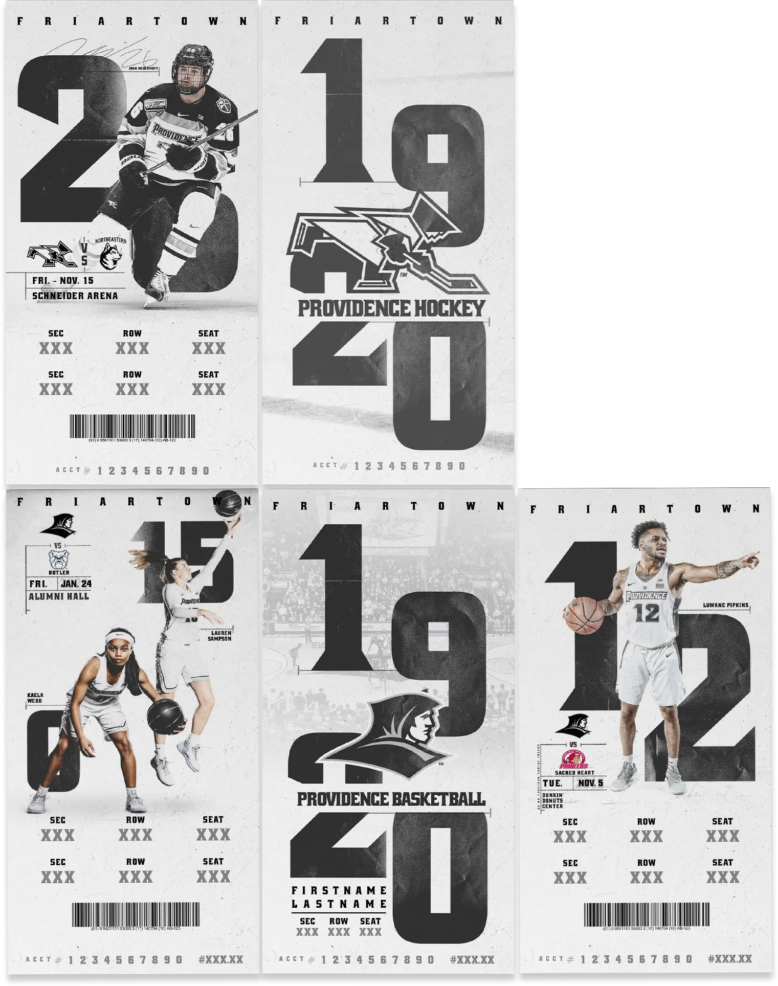
This is Friartown
Black and White and Bold All Over
Providence College Marketing Materials
Make an Impact
Delivering a Familiar Message
Delivering a strong, consistent message is always key when creating a marketing campaign with several deliverables.
Year after year Providence College strives to make an impact for their programs and Summit always rises to the challenge. This year, the Friars needed posters, magnets, schedule cards and tickets for their men’s basketball, women’s basketball and hockey programs.
Use Brand Equity
Building on a success
Our intent was to use the existing “This is Friartown” slogan and to build on the brand equity earned over past seasons.
It’s well-known in the area and is unique among other college teams. Additionally, men’s basketball had their own messaging: Us. We. Together. Family. Friars.


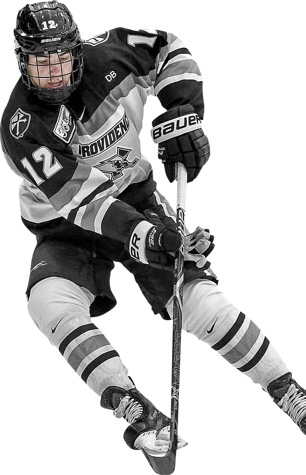
Big and Bold
Leaving a Strong Impression
Using a bold black and white color palette, we developed a campaign around stark, clean layouts with large typography.
The color photos jump with contrast from the solid backgrounds while silver and gray elements punctuate each piece. Finally, everything was distressed just enough to reflect the gritty, hard-working nature of each team.